30 Days of Chart Challenge
Published on November 5, 2025 by Akın
30 Days of Chart Challenge is a community run challenge on social media, created by Dominic Royé and Cédric Scherer The GitHub Page. The Challenge has a topic for each day and the participants are allowed to use any programming language, software or tool to create any type of data visualisation they want to create.
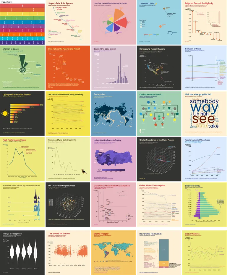
2025 was the first year I joined the challenge. I used exclusively Python (Matplotlib and Seaborn), made minor edits on Illustrator. Here are my contribution for each day. You can click on each visualisation to enlarge them.
Day 1: Fractions
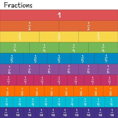
Every great journey starts with a single step, and complex challenges are best understood by breaking them down into their component parts. This foundational chart introduces the language of data, reminding us that every complex analysis is just a collection of fractions that collectively create a complete picture.
Day 2: Slope
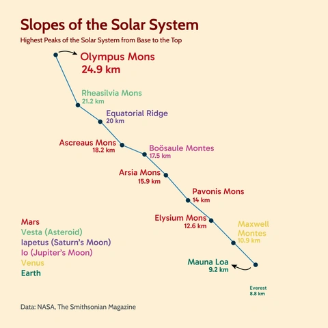
Our home planet’s mountains are miniatures compared to others in the Solar System. The highest peak in our Solar System, Olympus Mons, is more than three times higher than Mount Everest. Yet, if you were standing on top of the Martian giant, its immense base (which is roughly the size of France) would be invisible, lying far beyond the curvature of Mars.
Day 3: Circular
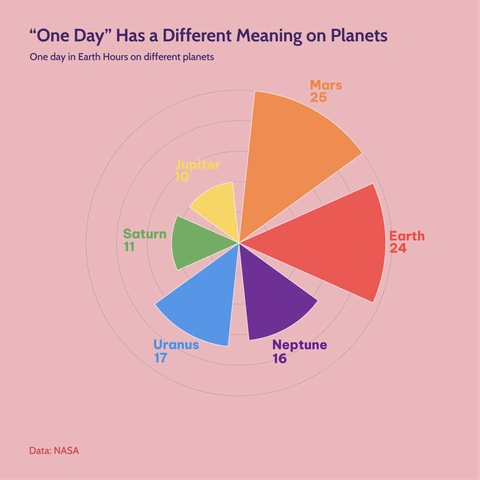
Comparing our planet to the others reveals some quite interesting stories. If you moved to Jupiter, you’d only have 10 hours to get your work done; meanwhile, a shift worker on Mars would gain a coveted extra hour every single day.
Day 4: Big or Small
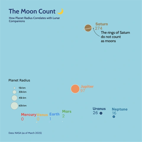
Earth has one moon, the Moon with a capital “M.” Meanwhile, the outer planets are true collectors, acting like cosmic vacuum cleaners. Saturn has so many moons that it forces astronomers to question the very definition of the term ‘moon’ as we know it.
Day 5: Ranking
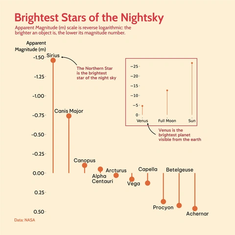
On a clear night with little light pollution, we see stars with varying brightness, sizes and colours. Apparent Magnitude measures this brightness. It’s a reverse logarithmic scale where lower numbers mean greater light. This chart ranks the brightest objects, revealing the true luminosity of nearby stellar giants like Sirius.
Day 6: Theme Nightingale
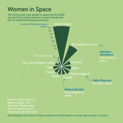
Florence Nightingale, the great British Nurse, tracked her patients’ symptoms using a chart like this, now named after her “Nightingale Rose Chart”. She was a pioneer who paved the way for efficient and data-driven decision-making in public health. I wanted to apply her pioneering method to a different frontier: space exploration.
This Nightingale chart focuses on the women who have broken the ceiling and reached orbit, comparing the contributions of different countries to this epic (and ongoing) journey.
Day 7: Outliers
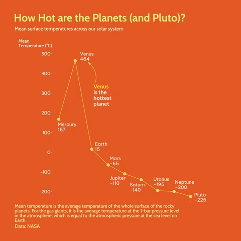
Considering the order of the planets from the Sun, we assume the closer a planet to the Sun, the hotter its average temperature. While this is generally true, Venus is a rebel. The greenhouse effect is so strong, the whole planet is basically a hot oven. As an outlier, Venus dramatically proves that distance from a star is only one factor; atmospheric composition is everything, and when we are looking for extraterrestrial life, we need to be little more creative.
Day 8: Histogram
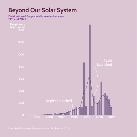
Exoplanets: planets orbiting distant stars were once only a prediction. Since the first confirmed exoplanet in the early 1990s, we have now verified more than 5,000, thanks to dedicated ground and space-based telescopes hunting for new exoplanets. This histogram captures the explosive rate of discovery, showing exactly when missions like Kepler and TESS turned a trickle of data into a galactic flood.
Day 9: Diverging
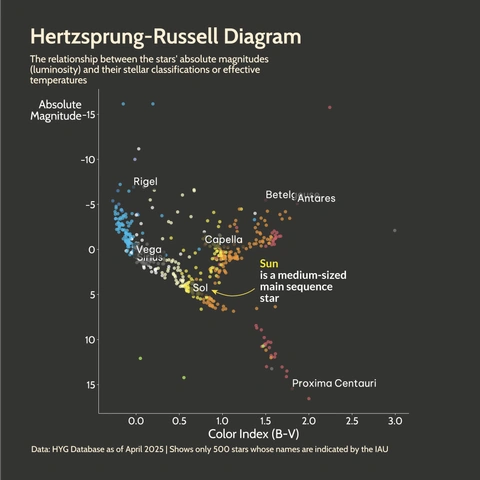
The Hertzsprung-Russell Diagram is arguably one of the the most important tools in astrophysics. It allows us to map the life cycle of every star in the galaxy based on its temperature (colour) and brightness (luminosity). The vast majority of stars (including our own Sun) fall along the diagonal ‘Main Sequence’ line, proving the power of data visualisation to uncover universal physical laws.
Day 10: Multimodal
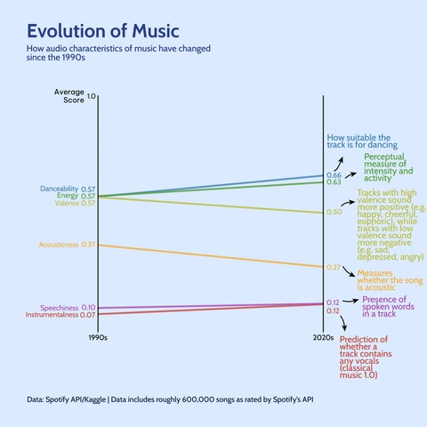
Is today’s music more danceable than 90s hits? Do tracks get happier over time? Are there more acoustic songs today than ever before? This chart uses music metrics from Spotify’s API to track the evolution of popular music over three decades, revealing that songs today are, in fact, slightly more energetic and suitable for dancing.
Day 11: Stripes
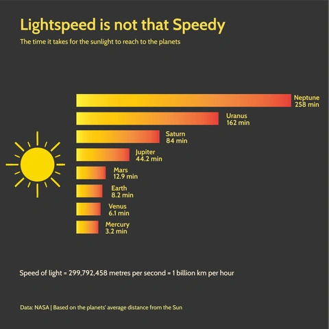
Light travels at the ultimate cosmic speed limit, but distances in space makes even light feel sluggish. A surprising fact: if our Sun disappeared right now, we wouldn’t know for about 8.2 minutes! This chart illustrates how long it takes for the sunlight to reach different planets.
Day 12: Data.gov
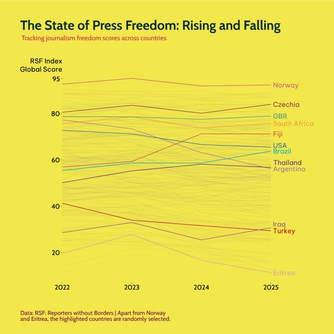
The Reporters without Borders’ (RSF) Global Index is a crucial indicator of the health of a democracy and the fundamental right to information. The RSF updated their methodology for the Index in 2022, comparing the Index scores over the years reveals a striking picture of how freedomg of press shifts across countries year-on-year.
Day 13: Clusters
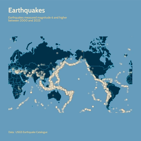
The Earth’s crust is constantly in motion, and this map is a visual confession of that restlessness. It plots decades of major earthquakes (magnitude 6 and higher), showing how these clusters perfectly outline the vast, shifting tectonic plates. Look closely at the concentration of points around the Pacific Ocean, commonly known as the Ring of Fire. Calm down mapping nerds, New Zealand is on the map!
Day 14: Kinship
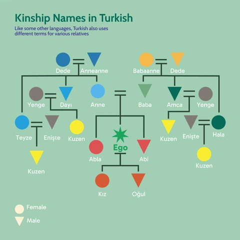
While in English uses one word for ‘uncle’ or ‘aunt’ regardless of which side of the parent they are related to, many languages specify whether that relative is on the mother’s side or the father’s side. This genealogy chart visually maps out the specific kinship names used in the Turkish for various relatives across three generations, showcasing the rich cultural depth embedded in family relations.
Day 15: Complicated
“Why’d you have to go and make things so complicated?” This word cloud takes the lyrics of Avril Lavigne’s famous song and breaks it down to its core components: because even pop songs can be quantified and analysed.

Day 16: Negative
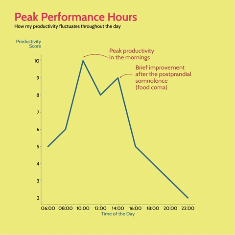
As a fortunate, “morning person” my productivity is high during the mornings, but unfortunately I can’t shake off the fatigue after lunch.
Day 17: Birds
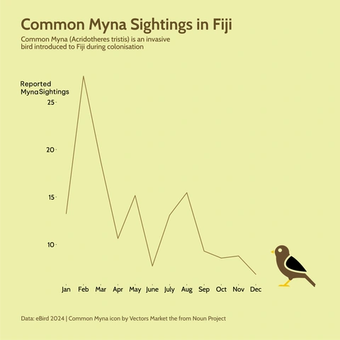
The Common Myna (Acridotheres tristis) is such a frequent bird to see in Fiji, one might think that they are endemic to the islands. However, they are an invasive species introduced during colonisation. This line chart tracks the monthly reported sightings for conservationists, showing how the frequency of reports peaks during the early months of the year.
Day 18: El País
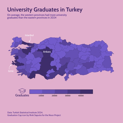
Higher education in Turkey shows a clear geographical trend. This map illustrates the distribution of university graduates across the Turkish provinces, with a noted concentration in the western provinces.
Day 19: Smooth
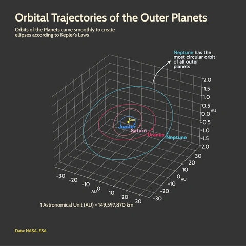
Kepler was right! His three laws of planetary motion were so precise that they didn’t just describe known orbits: they could predict new ones. His work was foundational to the discovery of Uranus, which was discovered using purely mathematical equations before being observed. This 3D visualisation captures the smooth, elliptical orbital trajectories of the outer planets.
Day 20: Urbanization
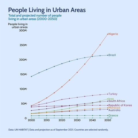
More and more people are choosing to live in urban areas, but this trend varies significantly between countries. While some nations have stabilised their urbanisation rates, others are experiencing a very steep and accelerating shift towards cities. This projection chart captures that massive difference, notably showing Nigeria’s urban population surging past Brazil’s in the coming decades.
Day 21: Fossils
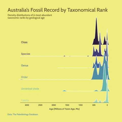
The rocks of Western Australia contain some of the oldest evidence of life on Earth, but our complex fossil record exploded much later! This unique ridge plot illustrates the Australian fossil record by taxonomical rank, showing a massive surge in biological diversity beginning about 500 million years ago: the dawn of complex life and the start of the Phanerozoic Eon.
Day 22: Stars
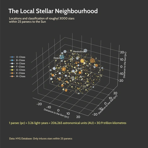
Look up! Our stellar neighbourhood is teeming with stars. Within just 25 parsecs, there are roughly 3,000 confirmed stars. This 3D map shows their locations and spectral classes; a visible manifestation of the Hertzsprung-Russell Diagram, showing that even close to home, the universe is crowded and incredibly difficult to reach.
Day 23: Log Scale
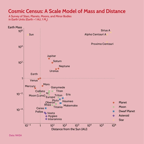
How big and distant are astronomical objects if we use our Earth as the scale? The answer is: too big and too distant for a standard chart! This visualisation uses a logarithmic scale on both axes to compare the mass and distance from the Sun for everything from tiny moons to distant stars, proving that when charting the cosmos, a log scale is (most likely) our only way to maintain perspective.
Day 24: WHO
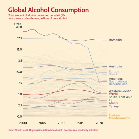
Consumption of alcohol trends are shifting worldwide, reflecting changing public health policies and economic realities. Using data compiled by the WHO, this line chart tracks the total alcohol consumption per adult over two decades, showcasing a comparison of different countries and WHO regions, and identifying which populations are consuming the most (what is going on in Romania?).
Day 25: Risk
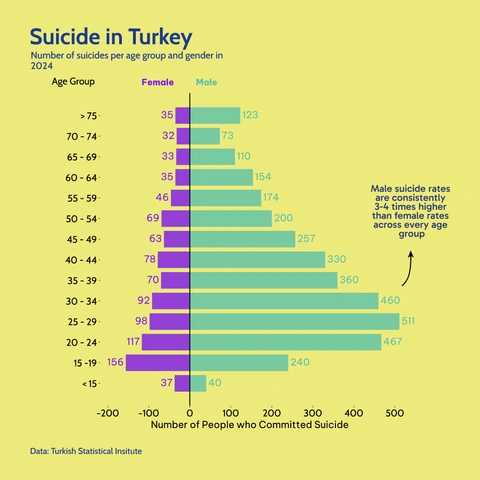
Managing a mental health crisis requires smart utilisation of data. This population pyramid style chart shows suicide rates among male and female Turkish citizens across all age groups. It highlights a significant and consistent disparity, where the male rate is dramatically higher, pointing to a critical area for targeted public health intervention.
Day 26: Monochrome
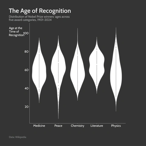
Does genius have an age limit? Explore the distribution of ages at which Nobel Prize winners received their recognition across five major categories, and if you still haven’t received yours, don’t worry some received their Nobel after their death. (I used a Violin Chart to highlight that it is the worst type of data visualisation)
Day 27: Noise
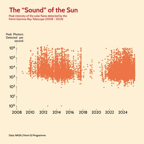
Listen to the cosmos! Our own Sun is loud and volatile. When it releases its immense energy in the form of a solar flare, high-energy photons are detected by the Fermi Gamma-Ray Telescope. This plot visualises the peak intensity of this solar “noise,” showcasing the immense, sporadic energy output generated by our own powerful star.
Day 28: Inclusion
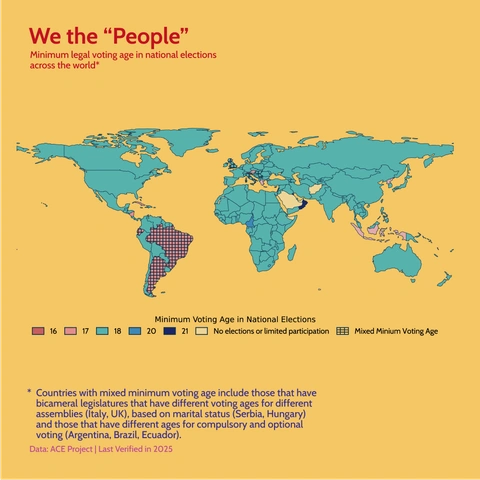
The definition of who is included as “the people” changes among different political systems. This world map visualises the minimum legal voting age for national elections across different countries. It highlights the political choice nations make in determining the age of consent for governance, with most of the world choosing age 18.
Day 29: Extraterrestrial
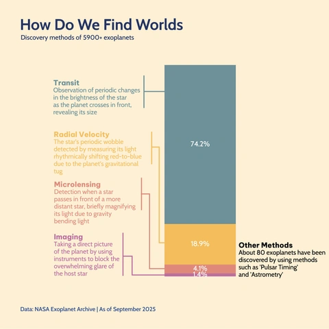
How are thousands of exoplanets discovered when they are so far away and so tiny, and next to a very large and bright object? This chart breaks down the primary methods used by astronomers to find the more than 5,900 confirmed worlds outside our solar system.
Day 30: NatGeo
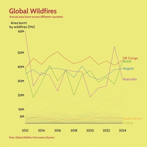
Fires have a vast impact globally. This chart tracks the annual area burnt by wildfires in select countries over a decade, revealing fluctuating trends across the globe.
